

 By:
By: Published under: data visualization, demographic maps
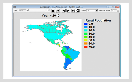
Demographic maps are an excellent way to display data that are available on a regional basis. Gradient color fills clearly show the values of a quantitative variable such as the percentage of the population in different countries that live in rural rather than urban areas. By adding controls that dynamically change the time period displayed, the Demographic Map Visualization Statlet makes changes in that variable over time very easy to see.
See Demographic Map Visualization in action!

Learn more about the extraordinary features in Statgraphics Centurion XVII.


