

 By:
By: Published under: dynamic demographic map, statistical analysis, big data, data analysis, Data analytics, Statgraphics, analytics software, Statgraphics 18, wind rose, population pyramid, hexagon plots, dynamic bubble chart, violin plot, bivariate density plot, heat map, open-high-low-close plot
On December 19, I presented a webinar in which I discussed 10 important techniques for visualizing the information contained in commonly collected data. A recording of the webinar, which lasts just over an hour, may be viewed by clicking here. For those of you who prefer to read rather than watch, I will summarize the top ten visualizations here. Note that the list is subjective and nothing is implied by the sequence in which they are presented.
Visualization #1 – Violin Plot
Most data analysts are very familiar with the box-and-whisker plot invented by John Tukey. Prof. Tukey’s diagram, which consists of a box covering the center half of the data and whiskers extending to the minimum and maximum, is a very useful 5-number summary of a sample of n numeric values. It's great for showing the range of the data, their center, and whether or not the data are skewed. However, there are certain potential aspects of a data variable, such as bimodality, which cannot be seen in his plot. A violin plot adds a nonparametric estimate of the probability density function of the data to the box-and-whisker plot, showing features that the boxplot cannot.
As an example, the figure below shows a violin plot displaying the duration of n = 232 consecutive eruptions of the Old Faithful Geyser in Yellowstone National Park.
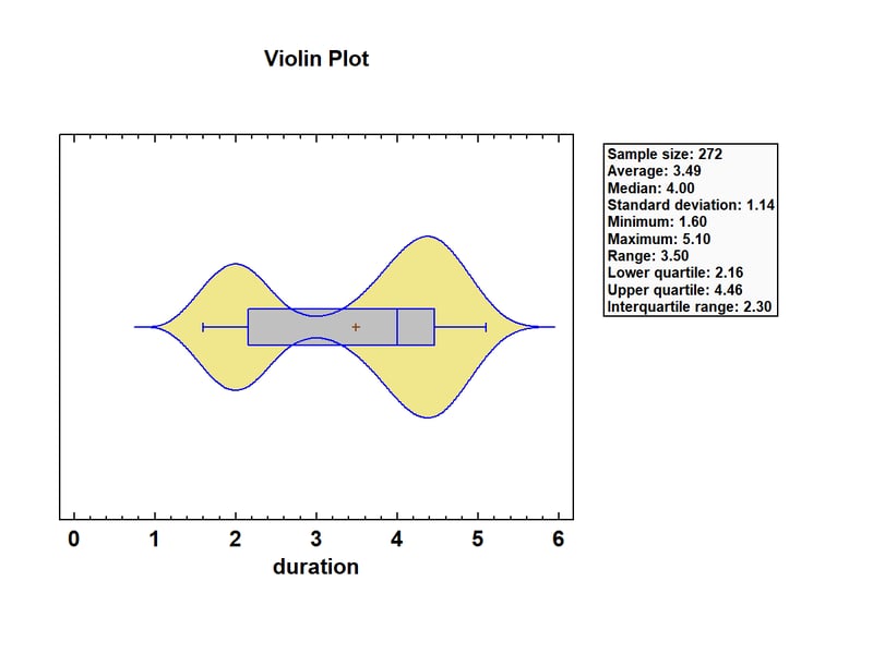
The eruptions ranged from 1.6 to 5.1 minutes, with a median of 4.0 minutes. The density function has 2 distinct peaks, one at about 2 minutes and the other at about 4.4 minutes. It’s actually very rare to observe an eruption with a duration close to 3 minutes. Also, by interactively changing the bandwidth of the smoother, the analyst can select a smoother that shows just the right amount of detail in the density estimate.
Visualization #2 – Bivariate Density Plot
When data consist of 2 related numeric columns, a very useful technique for visualizing the joint distribution of the 2 variables is the bivariate density plot. This plot uses a 2-dimensional nonparametric density estimator similar to that used in the violin plot. It calculates a weighted average of the number of observed data values at various places in the space of the 2 variables, from which it estimates the bivariate density function.
The plot below shows the estimated joint distribution of the duration of the eruptions of Old Faithful together with the waiting time until the next eruption.
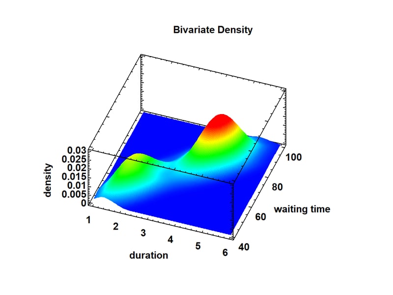
Again, 2 distinct peaks are visible: one corresponding to relatively short eruptions with short waiting times until the next eruption, and a second peak corresponding to longer eruptions after which the waiting time until the next eruption is also large. This results in a very strong correlation between the 2 variables. The bivariate density plot may be displayed either as a surface plot as shown above or a contour plot as shown below.
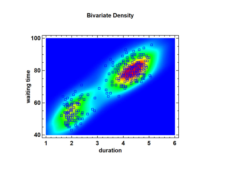
Note the well-defined clusters of points around the 2 peaks.
Visualization #3: Population Pyramid
Researchers who study population need to display the distribution of members of that population by age and gender. An excellent tool for visualizing that distribution is the population pyramid. The graph below shows a population pyramid for residents of the United States in 1950:
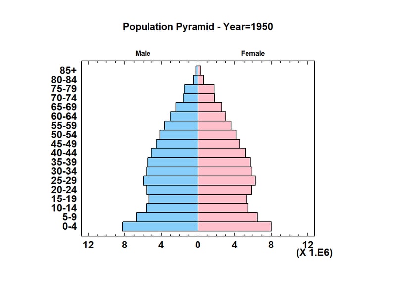
The length of each bar is proportional to the number of people within a certain age category and of a specific gender. Note that in 1950, 5 years after the end of World War II, the largest age category consisted of children between 0 and 4 years old (the so-called “Baby Boomers”). In Statgraphics, the population pyramid is implemented as an animated Statlet. To watch how the population changed between 1950 and 2012, click on the short video below:
http://www.statvision.com/blog/pyramid.mp4
You’ll see the Baby Boomers get older and the fraction of the population in the 85+ category grow dramatically (particularly among women).
Visualization #4: Wind Rose
When locating a wind turbine or designing the runways at a new airport, it is important to understand the speed and direction of the winds at various locations. It’s also important to understand how the winds change throughout a day and throughout the months of the year. A specially designed radial plot called a wind rose is ideal for displaying wind speed and direction. The graph below shows the winds at Midway Airport in Chicago, using measurements taken at 9:53AM everyday between January 1 and December 15, 2018.
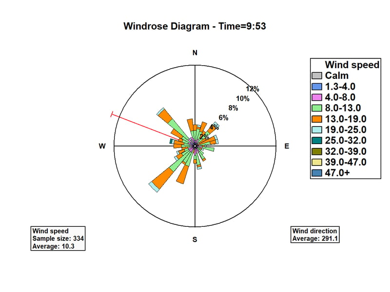
The wind direction has been divided into 32 intervals, each consisting of 11.25 degrees of the compass. "Petals" have been drawn with length proportional to the number of days in which the wind was observed to be coming from each direction. There are two dominant directions: some days from the northwest and other days from the southwest. Each petal is also subdivided to show the conditional distribution of wind speed for each direction. The red ray shows the average wind direction, weighted by wind speed.
To visualize changes in the wind throughout the day, we can interactively change the time at which the distribution is displayed. Watch how the wind rose changes in the video below:
www.statvision.com/blog/windbyhour.mp4
To visualize changes in the wind throughout the year, the distribution of wind speed and direction may be displayed for each month. Watch how the wind rose changes in the video below:
www.statvision.com/blog/windbymonth.mp4
Visualization #5: Dynamic Bubble Chart
When working with multivariate time series data, it can be challenging to display that data is an understandable format that is not too cluttered. Adding animation to a static graph is one way of helping visualize changes over time.
For example, the World Bank's website contains information about various demographic features of every country in the world, including how those features have changed over time. One of the most interesting variables that they measure is life expectancy, which has increased dramatically over the last 50 years. There are also large differences in life expectancy around the world, correlated in part with variables such as fertility rate, infant mortality, and percentage of the population within a country that lives in rural areas. In the plot below, each bubble represents a different country. The location, size and color of the bubbles show values of these variables for each country in 1961.
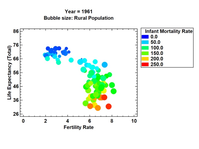
In 1961, there were 2 major groups of countries. One group had life expectancies between 65 and 75 years and fertility rates between approximately 2 and 4 children per woman. The other group had considerably lower life expectancies, higher fertility rates, higher infant mortality, and a tendency for more of the population to live in rural areas (with one noticeable exception).
By adding animation to this chart, changes in world demographics are easy to see. To see how the world changed between 1961 and 2009, watch the following video:
www.statvision.com/blog/bubblechart.mp4
You'll notice a consistent move toward longer life expectancy, fewer children, more urban populations, and a dramatic reduction in infant mortality. You'll also notice a couple of exceptions to this general pattern.
Visualization #6: Dynamic Gradient Map
A second effective way of viewing life expectancy around the world is to create a gradient map. In such a map, color is used to display the life expectancy in each country. The map below shows life expectancy in 1961:
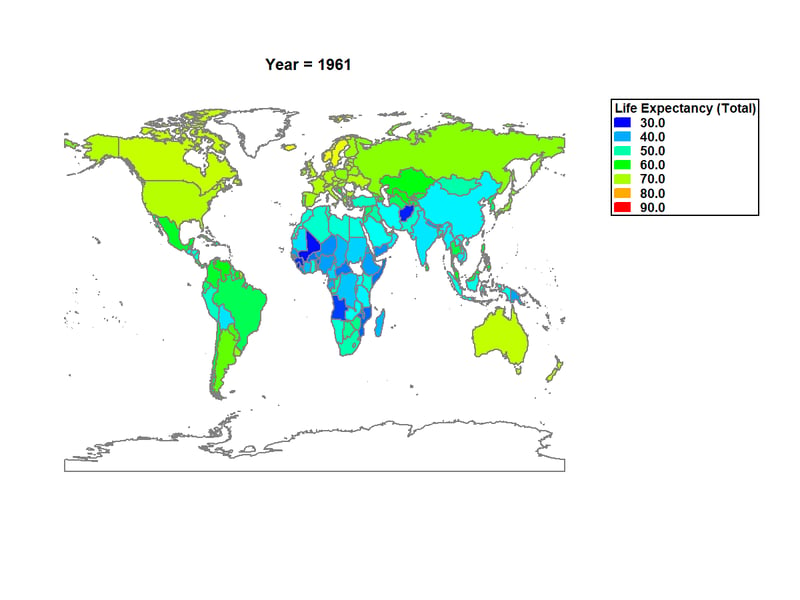
In 1961, only a few countries had life expectancy approaching 70 years. Adding animation to the graph is very effective in showing changes over time, as in the video below:
www.statvision.com/blog/worldmap.mp4
You'll see life expectancy rise around the world, although significant differences remain between more and less developed countries.
Visualization #7: Time Series Baseline Plot
in 2018, climate change was a topic of major interest. One of the measures used to track climate changes is the Oceanic Niño Index (ONI), which is an index related to sea water temperature in the tropical Pacific. Values of the ONI greater than 0.5 define an El Niño, while values below -0.5 define a La Niña. To visualize cycles in the ONI, a very effective visualization is produced by the time series baseline plot shown below:
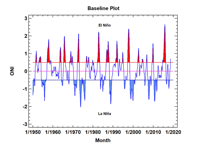
Note the regular pattern of El Niños and La Niñas. The duration of each is emphasized by shading the area above and below the defining limits. If you look closely, you'll notice that El Niños are somewhat more frequent than La Niñas, although La Niñas tend to last longer when they occur. You'll also note that we are just entering an El Niño period. How strong it will be and how long it will last remains to be seen.
Visualization #8: Open-High-Low-Close Candlestick Plot with Forecasts
One of the more interesting financial time series to follow in 2018 was the price of Bitcoin. It started out very high at the beginning of the year but lost much of its value over the subsequent months. It's interesting to look at the time series and attempt to predict what will happen in the future.
To display the market prices for Bitcoin, the following Open-High-Low-Close (OHLC) candlestick plot may be created:
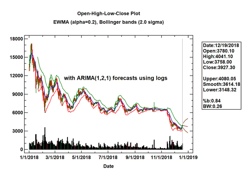
On each day, a vertical line is drawn connecting the low and high market prices for that day. If the closing price for the day was less than the closing price on the previous day, the line is drawn in red. Otherwise it is drawn in green. The blue line shown in the plot is an exponentially weighted moving average (EWMA) of consecutive closing prices, in this case calculated using a smoothing parameter a = 0.2. On either side of the EWMA are Bollinger bands, drawn at plus and minus 2 times an exponentially weighted estimate of the standard deviation of the differences between the actual and smoothed closing prices. The width of the Bollinger bands is often interpreted as a measure of volatility. Early in the year, the bands were wide apart. In the fall, the price stabilized and the bands became closer together. Then in November, the price began to fall precipitously.
Added to the last available data value (December 19) is the result of applying the Statgraphics Automatic Forecasting procedure. Of many models tested, the procedure selected an ARIMA(1,2,1) model applied to the logarithms of the closing prices to forecast the price for the remainder of the year. Although the price is forecast to go down, the 95% forecast bands indicate that the price could easily go up or down.
Visualization #9: Heat Map
When the data to be visualized may be classified according to 2 factors, a good way to visualize it is by creating a heat map. A heat map shows the value of a selected numeric variable at all combinations of the 2 factors, using color to indicate the level of that variable. For example, the plot below shows fish counts obtained at 13 locations in the Gulf of Maine during the years 1963 to 2003:
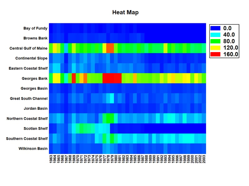
Notice that 2 locations, the Central Gulf of Maine and Georges Bank, are consistently greater than the other regions. In general, the levels in the different regions appear to be positively correlated. Note also that there was a period of years, 1977 to 1981, in which the counts were unusually high in several locations. On the other hand, there are a few locations in which few fish are ever seen. Note that this heat map is much more effective than plotting 13 lines versus time, which gives an almost unreadable display.
Visualization #10: Hexagon Plot for Big Data
2018 continued to see increasing interest in analyzing big data. Large data sets present unique challenges for visualization. Commonly used plots such as scatterplots are not effective when millions of points need to be displayed, since all they produce is a large blob.
One good alternative to the standard scatterplot is the hexagon plot. A hexagon plot is created by first dividing the X-Y space into a tessellation of non-overlapping hexagonal regions. The number of data values in each region is then counted. If the number of points in a region is small (perhaps 2 or less), the individual points are plotted as usual. If the number of points in the region is larger than 2, then the region is shaded with a color that becomes darker as the number of data values in the region increases.
As an example, the plot below shows the result of fitting a linear regression to data for all U.S. commercial flights in 2008 (of which there were approximately 7 million).

The fitted model relates the arrival delay of each flight to its departure delay. The darkest hexagons are close to the regression line with the arrival delay for those flights being very similar to their departure delay. Some skewness above the line can also be seen.
In Statgraphics, the default behavior is to switch automatically from scatterplots to hexagon plots whenever the sample size exceeds n = 100,000. It makes plots such as residual plots much more useful.
Conclusion
The 10 graphs I have selected are all good at extracting information in ways that viewers can easily comprehend. While plots such as the wind rose have very special uses, others such as the heat map and hexagon plot are useful for displaying many different kinds of data. I'm looking forward to discovering other tools for data visualization during 2019.


